Noola

OVERVIEW

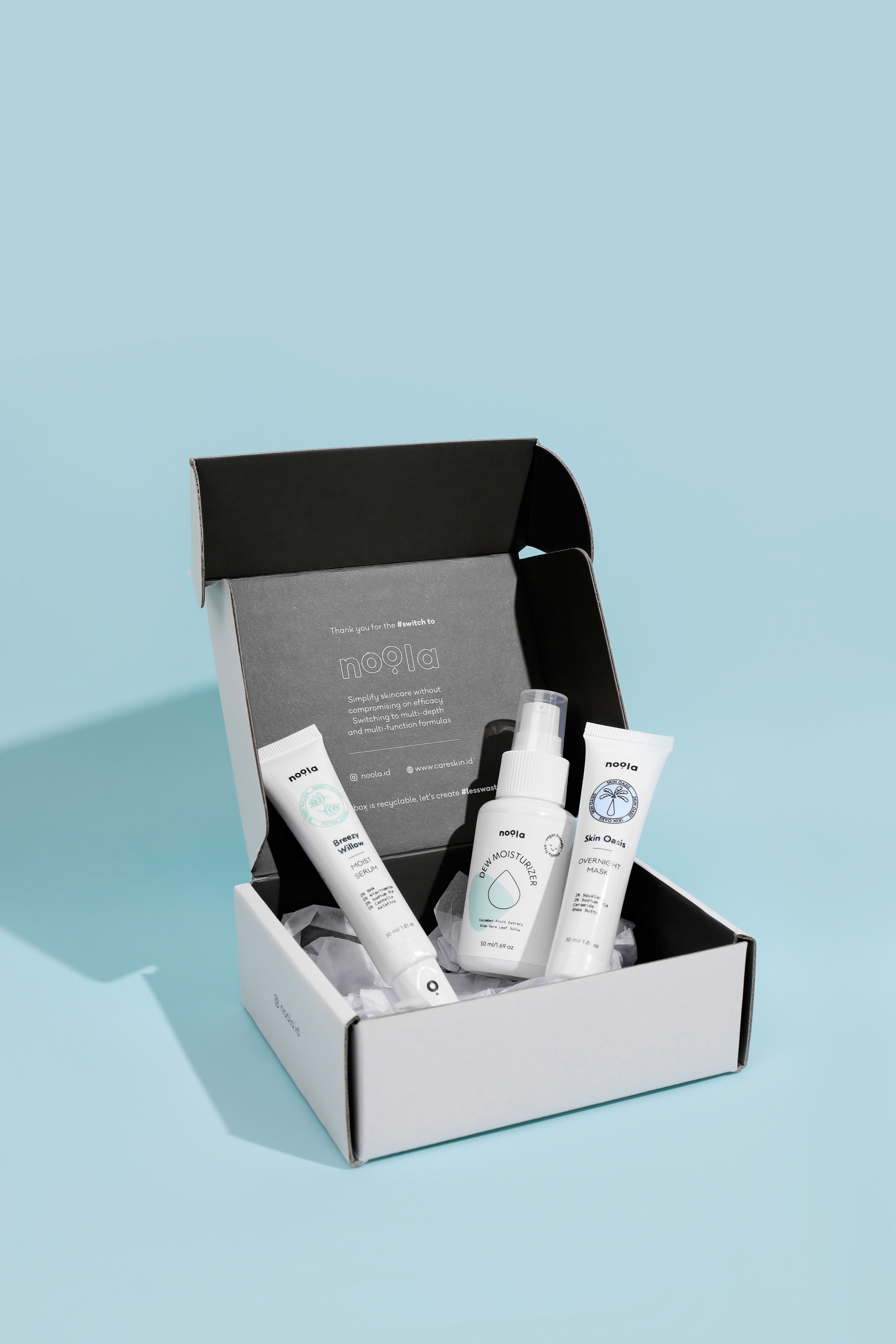
Local Brand Noola — Packaging Design The concept focused on creating a unified visual identity that symbolizes moisture and hydration. Every design element was built from the same water drop shape, forming a cohesive system where all assets flow together with consistency and clarity.

YEAR

2020

ROLE

CREATIVE DIRECTION

SERVICES

BRAND DESIGN

PACKAGING

About the project

The branding for Noola draws inspiration from the shape of a water droplet, a simple form that embodies moisture, clarity, and renewal. This single shape became the foundation of the identity, serving as a unifying element across the brand.

From the droplet, three distinct variations were developed to represent Noola’s three products. Each carries its own character while remaining rooted in the same form, creating a system that feels fluid, cohesive, and reflective of the brand’s essence.

The design was intentionally created to be clear, effective, and simple, ensuring that each element communicates its purpose effortlessly. Each pillar of the brand is represented through distinct iconography that reflects its unique identity. Breezy Willow incorporates a leaf motif shaped from soft, teardrop forms, symbolizing freshness and lightness. Skin Oasis embodies a beach-inspired iconography, evoking feelings of relaxation and rejuvenation. Dew Moisturizer centers on a teardrop symbol, representing hydration and purity. The overall color palette is drawn from natural elements particularly the tones of water and nature to create a cohesive, calming, and organic visual language that ties all the pillars together.

Smooth Scroll
This will hide itself!

Noola

OVERVIEW

Local Brand Noola — Packaging Design The concept focused on creating a unified visual identity that symbolizes moisture and hydration. Every design element was built from the same water drop shape, forming a cohesive system where all assets flow together with consistency and clarity.

YEAR

2020

ROLE

CREATIVE DIRECTION

SERVICES

BRAND DESIGN

PACKAGING

About the project

The branding for Noola draws inspiration from the shape of a water droplet, a simple form that embodies moisture, clarity, and renewal. This single shape became the foundation of the identity, serving as a unifying element across the brand.

From the droplet, three distinct variations were developed to represent Noola’s three products. Each carries its own character while remaining rooted in the same form, creating a system that feels fluid, cohesive, and reflective of the brand’s essence.

The design was intentionally created to be clear, effective, and simple, ensuring that each element communicates its purpose effortlessly. Each pillar of the brand is represented through distinct iconography that reflects its unique identity. Breezy Willow incorporates a leaf motif shaped from soft, teardrop forms, symbolizing freshness and lightness. Skin Oasis embodies a beach-inspired iconography, evoking feelings of relaxation and rejuvenation. Dew Moisturizer centers on a teardrop symbol, representing hydration and purity. The overall color palette is drawn from natural elements particularly the tones of water and nature to create a cohesive, calming, and organic visual language that ties all the pillars together.

Smooth Scroll
This will hide itself!

Noola

OVERVIEW

Local Brand Noola — Packaging Design The concept focused on creating a unified visual identity that symbolizes moisture and hydration. Every design element was built from the same water drop shape, forming a cohesive system where all assets flow together with consistency and clarity.

YEAR

2020

ROLE

CREATIVE DIRECTION

SERVICES

BRAND DESIGN

PACKAGING

About the project

The branding for Noola draws inspiration from the shape of a water droplet, a simple form that embodies moisture, clarity, and renewal. This single shape became the foundation of the identity, serving as a unifying element across the brand.

From the droplet, three distinct variations were developed to represent Noola’s three products. Each carries its own character while remaining rooted in the same form, creating a system that feels fluid, cohesive, and reflective of the brand’s essence.

The design was intentionally created to be clear, effective, and simple, ensuring that each element communicates its purpose effortlessly. Each pillar of the brand is represented through distinct iconography that reflects its unique identity. Breezy Willow incorporates a leaf motif shaped from soft, teardrop forms, symbolizing freshness and lightness. Skin Oasis embodies a beach-inspired iconography, evoking feelings of relaxation and rejuvenation. Dew Moisturizer centers on a teardrop symbol, representing hydration and purity. The overall color palette is drawn from natural elements particularly the tones of water and nature to create a cohesive, calming, and organic visual language that ties all the pillars together.
Smooth Scroll
This will hide itself!

Create a free website with Framer, the website builder loved by startups, designers and agencies.